Halftone

Halftone is the reprographic technique that simulates continuous tone imagery through the use of dots, varying either in size, in shape or in spacing. “Halftone” can also be used to refer specifically to the image that is produced by this process.

Where continuous tone imagery contains an infinite range of colors or greys, the halftone process reduces visual reproductions to an image that is printed with only one color of ink, in dots of differing size. This reproduction relies on a basic optical illusion—that these tiny halftone dots are blended into smooth tones by the human eye. At a microscopic level, developed black-and-white photographic film also consists of only two colors, and not an infinite range of continuous tones. For details, see film grain.

Just as color photography evolved with the addition of filters and film layers, color printing is made possible by repeating the halftone process for each subtractive color—most commonly using what is called the “CMYK color model”. The semi-opaque property of ink allows halftone dots of different colors to create another optical effect—full-color imagery.

History

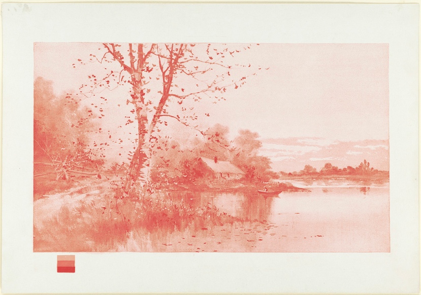
The first printed photo using a halftone, December 2, 1873.

William Fox Talbot is credited with the idea of halftone printing. In the early 1850s, he suggested using “photographic screens or veils” in connection with a photographic intaglio process.

Several different kinds of screens were proposed during the following decades. One of the well known attempts was by Stephen H. Horgan while working for the New York Daily Graphic. The first printed photograph was an image of Steinway Hallin Manhattan published on December 2, 1873. The Graphic then published “the first reproduction of a photograph with a full tonal range in a newspaper” on March 4, 1880 (entitled “A Scene in Shantytown”) with a crude halftone screen.

The first truly successful commercial method was patented by Frederic Ives of Philadelphia in 1881. Although he found a way of breaking up the image into dots of varying sizes, he did not make use of a screen. In 1882, the German Georg Meisenbach patented a halftone process in England. His invention was based on the previous ideas of Berchtold and Swan. He used single lined screens which were turned during exposure to produce cross-lined effects. He was the first to achieve any commercial success with relief halftones.

Shortly afterwards, Ives, this time in collaboration with Louis and Max Levy, improved the process further with the invention and commercial production of quality cross-lined screens.[3]

The relief halftone process proved almost immediately to be a success. The use of halftone blocks in popular journals became regular during the early 1890s.

The development of halftone printing methods for lithography appears to have followed a largely independent path. In the 1860s, A. Hoen & Co. focused on methods allowing artists to manipulate the tones of hand-worked printing stones. By the 1880s, Hoen was working on halftone methods that could be used in conjunction with either hand-worked or photolithographic stones.

Multiple screens and color halftoning

Three examples of color halftoning with CMYK separations. From left to right: The cyan separation, the magenta separation, the yellow separation, the black separation, the combined halftone pattern and finally how the human eye would observe the combined halftone pattern from a sufficient distance.

This close-up of a halftone print shows that magenta on top of yellow appears as orange/red, and cyan on top of yellow appears as green.

When different screens are combined, a number of distracting visual effects can occur, including the edges being overly emphasized, as well as a moiré pattern. This problem can be reduced by rotating the screens in relation to each other. This screen angle is another common measurement used in printing, measured in degrees clockwise from a line running to the left (9 o’clock is zero degrees).

Halftoning is also commonly used for printing color pictures. The general idea is the same, by varying the density of the four primary printing colors, cyan, magenta, yellow and black (abbreviation CMYK), any particular shade can be reproduced.

In this case there is an additional problem that can occur. In the simple case, one could create a halftone using the same techniques used for printing shades of grey, but in this case the different printing colors have to remain physically close to each other to fool the eye into thinking they are a single color. To do this the industry has standardized on a set of known angles, which result in the dots forming into small circles or rosettes.

The dots cannot easily be seen by the naked eye, but can be discerned through a microscope or a magnifying glass.

DOT SHAPES

Though round dots are the most common used, there are different dot types available, each of them having their own characteristics. They can be used simultaneously to avoid the moiré effect. Generally, the preferred dot shape is also dependent on the printing method or the printing plate.

  • Round dots: most common, suitable for light images, especially for skin tones. They meet at a tonal value of 70%.
  • Elliptical dots: appropriate for images with many objects. Elliptical dots meet at the tonal values 40% (pointed ends) and 60% (long side), so there is a risk of a pattern.
  • Square dots: best for detailed images, not recommended for skin tones. The corners meet at a tonal value of 50%. The transition between the square dots can sometimes be visible to the human eye.

Digital halftoning

Digital halftoning has been replacing photographic halftoning since the 1970s when “electronic dot generators” were developed for the film recorder units linked to color drum scanners made by companies such as Crosfield Electronics, Hell and Linotype-Paul.

In the 1980s, halftoning became available in the new generation of imagesetter film and paper recorders that had been developed from earlier “laser typesetters”. Unlike pure scanners or pure typesetters, imagesetters could generate all the elements in a page including type, photographs and other graphic objects. Early examples were the widely used Linotype Linotronic 300 and 100 introduced in 1984, which were also the first to offer PostScript RIPs in 1985.

Kép

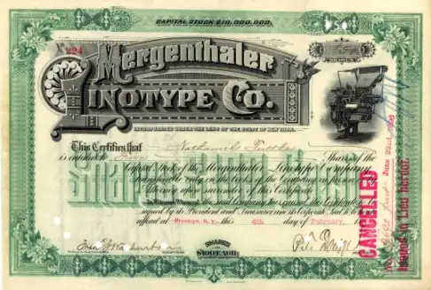
An 1896 Mergenthaler Linotype stock certificate

Kép

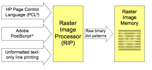
Generating the raster image data

Early laser printers from the late 1970s onward could also generate halftones but their original 300 dpi resolution limited the screen ruling to about 65 lpi. This was improved as higher resolutions of 600 dpi and above, and dithering techniques, were introduced.

Kép  
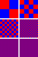
An illustration of dithering. Red and blue are the only colors used but, as the red and blue squares are made smaller, the patch appears violet.

Kép

A photograph of sub-pixel display elements on a laptop’s LCD screen

All halftoning uses a high frequency/low frequency dichotomy. In photographic halftoning, the low frequency attribute is a local area of the output image designated a halftone cell. Each equal-sized cell relates to a corresponding area (size and location) of the continuous-tone input image. Within each cell, the high frequency attribute is a centered variable-sized halftone dot composed of ink or toner. The ratio of the inked area to the non-inked area of the output cell corresponds to the luminance or graylevel of the input cell. From a suitable distance, the human eye averages both the high frequency apparent gray level approximated by the ratio within the cell and the low frequency apparent changes in gray level between adjacent equally spaced cells and centered dots.

Digital halftoning uses a raster image or bitmap within which each monochrome picture element or pixel may be on or off, ink or no ink. Consequently, to emulate the photographic halftone cell, the digital halftone cell must contain groups of monochrome pixels within the same-sized cell area. The fixed location and size of these monochrome pixels compromises the high frequency/low frequency dichotomy of the photographic halftone method. Clustered multi-pixel dots cannot “grow” incrementally but in jumps of one whole pixel. In addition, the placement of that pixel is slightly off-center. To minimize this compromise, the digital halftone monochrome pixels must be quite small, numbering from 600 to 2,540, or more, pixels per inch. However, digital image processing has also enabled more sophisticated dithering algorithms to decide which pixels to turn black or white, some of which yield better results than digital halftoning. Digital halftoning based on some modern image processing tools such as nonlinear diffusion and stochastic flipping has also been proposed recently.

Kép

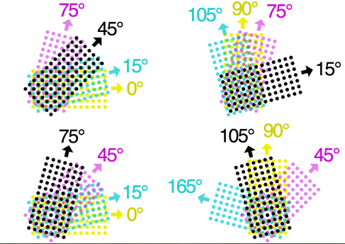
Examples of typical CMYK halftone screen angles

RGB

RGB

First_lithographic_print_in_the_primary_triad_of_colors_(yellow)_by_Boston_Public_Library   First_lithographic_print_in_the_primary_triad_of_colors_Blue_by_Boston_Public_Library  First_lithographic_print_in_the_primary_triad_of_colors_(redyellow)_by_Boston_Public_Library  First_lithographic_print_in_the_primary_triad_of_colors_by_Boston_Public_Library

Chromolithograph showing the three color technique. 1893, L. Prang & Co. 1893
Harlow, Louis K. (Louis Kinney), 1850-1913 (artist); L. Prang & Co. (publisher)

Still-life_of_fruit_using_3-color_process

The first widely reproduced image printed using the three-color process, by William Kurtz (January 1893)

Modern Process

The process of color separation starts by separating the original artwork into red, green, and blue components (for example by a digital scanner). Before digital imaging was developed, the traditional method of doing this was to photograph the image three times, using a filter for each color. However this is achieved, the desired result is three grayscale images, which represent the red, green, and blue (RGB) components of the original image:

The next step is to invert each of these separations. When a negative image of the red component is produced, the resulting image represents the cyan component of the image. Likewise, negatives are produced of the green and blue components to produce magenta and yellow separations, respectively. This is done because cyan, magenta, and yellow are subtractiveprimaries which each represent two of the three additive primaries (RGB) after one additive primary has been subtracted from white light.

Cyan, magenta, and yellow are the three basic colors used for color reproduction. When these three colors are variously used in printing, the result should be a reasonable reproduction of the original, but in practice this is not the case. Due to limitations in the inks, the darker colors are dirty and muddied. To resolve this, a black separation is also created, which improves the shadow and contrast of the image. Numerous techniques exist to derive this black separation from the original image; these include grey component replacement, under color removal, and under color addition. This printing technique is referred to as CMYK (the “K” stands for Key, a traditional word for the black printing plate).

Today’s digital printing methods do not have the restriction of a single color space that traditional CMYK processes do. Many presses can print from files that were ripped with images using either RGB or CMYK modes. The color reproduction abilities of a particular color space can vary; the process of obtaining accurate colors within a color model is called color matching.

Screening

Inks used in color printing presses are semi-transparent and can be printed on top of each other to produce different hues. For example, green results from printing yellow and cyan inks on top of each other. However, a printing press cannot vary the amount of ink applied to particular picture areas except through “screening,” a process that represents lighter shades as tiny dots, rather than solid areas, of ink. This is analogous to mixing white paint into a color to lighten it, except the white is the paper itself. In process color printing, the screened image, or halftone for each ink color is printed in succession. The screen grids are set at different angles, and the dots therefore create tiny rosettes, which, through a kind of optical illusion, appear to form a continuous-tone image. You can view the halftoning, which enables printed images, by examining a printed picture under magnification.

Traditionally, halftone screens were generated by inked lines on two sheets of glass that were cemented together at right angles. Each of the color separation films were then exposed through these screens. The resulting high-contrast image, once processed, had dots of varying diameter depending on the amount of exposure that area received, which was modulated by the grayscale separation film image.

The glass screens were made obsolete by high-contrast films where the halftone dots were exposed with the separation film. This in turn was replaced by a process where the halftones are electronically generated directly on the film with a laser. Most recently, computer to plate (CTP) technology has allowed printers to bypass the film portion of the process entirely. CTP images the dots directly on the printing plate with a laser, saving money, and eliminating the film step. The amount of generation loss in printing a lithographic negative onto a lithographic plate, unless the processing procedures are completely ignored, is almost completely negligible, as there are no losses of dynamic range, no density gradations, nor are there any colored dyes, or large silver grains to contend with in an ultra-slow rapid access negative.

Screens with a “frequency” of 60 to 120 lines per inch (lpi) reproduce color photographs in newspapers. The coarser the screen (lower frequency), the lower the quality of the printed image. Highly absorbent newsprint requires a lower screen frequency than less-absorbent coated paper stock used in magazines and books, where screen frequencies of 133 to 200 lpi and higher are used.

The measure of how much an ink dot spreads and becomes larger on paper is called dot gain. This phenomenon must be accounted for in photographic or digital preparation of screened images. Dot gain is higher on more absorbent, uncoated paper stock such as newsprint.

History of color printing

History of printing
  • Woodblock printing (200)
  • Movable type (1040)
  • Printing press (1454)
  • Etching (ca. 1500)
  • Mezzotint (1642)
  • Aquatint (1768)
  • Lithography (1796)
  • Chromolithography (1837)
  • Rotary press (1843)
  • Offset printing (1875)
  • Hectograph (19th century)
  • Hot metal typesetting (1886)
  • Mimeograph (1890)
  • Screen printing (1907)
  • Spirit duplicator (1923)
  • Dye-sublimation (1957)
  • Phototypesetting (1960s)
  • Dot matrix printer (1964)
  • Laser printing (1969)
  • Thermal printing (ca. 1972)
  • Inkjet printing (1976)
  • 3D printing (1986)
  • Digital press (1993)

Woodblock printing on textiles preceded printing on paper in both Asia and Europe, and the use of different blocks to produce patterns in color was common. The earliest way of adding color to items printed on paper was by hand-coloring, and this was widely used for printed images in both Europe and Asia. Chinese woodcuts have this from at least the 13th century, and European ones from very shortly after their introduction in the 15th century, where it continued to be practiced, sometimes at a very skilled level, until the 19th century—elements of the official British Ordnance Survey maps were hand-colored by boys until 1875. Early European printed books often left spaces for initials, rubrics and other elements to be added by hand, just as they had been in manuscripts, and a few early printed books had elaborate borders and miniatures added. However this became much rarer after about 1500.

CHINA

Michael Sullivan writes that “the earliest color printing known in China, and indeed in the whole world, is a two-color frontispiece to a Buddhist sutra scroll, dated 1346. Color prints were also used later in the Ming Dynasty. In Chinese woodblock printing, early color woodcuts mostly occur in luxury books about art, especially the more prestigious medium of painting. The first known example is a book on ink-cakes printed in 1606, and color technique reached its height in books on painting published in the seventeenth century. Notable examples are the Treatise on the Paintings and Writings of the Ten Bamboo Studio of 1633, and the Mustard Seed Garden Painting Manual published in 1679 and 1701.

Europe

Most early methods of color printing involved several prints, one for each color, although there were various ways of printing two colors together if they were separate. Liturgical and many other kinds of books required rubrics, normally printed in red; these were long done by a separate print run with a red forme for each page. Other methods were used for single leaf prints. The chiaroscuro woodcut was a European method developed in the early 16th century, where to a normal woodcut block with a linear image (the “line block”), one or more colored “tone blocks” printed in different colors would be added. This was the method developed in Germany; in Italy only tone blocks were often used, to create an effect more like a wash drawing. Jacob Christoph Le Blon developed a method using three intaglio plates, usually in mezzotint; these were overprinted to achieve a wide range of colors.

JAPAN

In Europe and Japan, color woodcuts were normally only used for prints rather than book illustrations. In Japan color technique, called nishiki-e in its fully developed form, spread more widely, and was used for prints, from the 1760s on. Text was nearly always monochrome, as were images in books, but the growth of the popularity of ukiyo-e brought with it demand for ever increasing numbers of colors and complexity of techniques. By the nineteenth century most artists worked in color. The stages of this development were:

  • Sumizuri-e (墨摺り絵, “ink printed pictures”) – monochrome printing using only black ink
  • Benizuri-e (紅摺り絵, “crimson printed pictures”) – red ink details or highlights added by hand after the printing process;green was sometimes used as well
  • Tan-e (丹絵) – orange highlights using a red pigment called tan
  • Aizuri-e (藍摺り絵, “indigo printed pictures”), Murasaki-e (紫絵, “purple pictures”), and other styles in which a single color would be used in addition to, or instead of, black ink
  • Urushi-e (漆絵) – a method in which glue was used to thicken the ink, emboldening the image; gold, mica and other substances were often used to enhance the image further. Urushi-e can also refer to paintings using lacquer instead of paint; lacquer was very rarely if ever used on prints.
  • Nishiki-e (錦絵, “brocade pictures”) – a method in which multiple blocks were used for separate portions of the image, allowing a number of colors to be utilized to achieve incredibly complex and detailed images; a separate block would be carved to apply only to the portion of the image designated for a single color. Registration marks called kentō (見当) were used to ensure correspondence between the application of each block.

19th century

The modern revival of colour-printing from wood-blocks, inaugurated by Whittingham, Leighton, and others, owes its full success to the energy, enterprise, and artistic skill of Edmund Evans. It is this printer that we have to thank for the delightful coloured plates by Caldecott, Greenaway, and Crane, that during the last thirty years have won the affection of old and young.

English coloured books (1906)

In the 19th century a number of different methods of color printing, using woodcut (technically Chromoxylography) and other methods, were developed in Europe, which for the first time achieved widespread commercial success, so that by the later decades the average home might contain many examples, both hanging as prints and as book illustrations. George Baxter patented in 1835 a method using an intaglio line plate (or occasionally a lithograph), printed in black or a dark color, and then overprinted with up to twenty different colors from woodblocks. Edmund Evans used relief and wood throughout, with up to eleven different colors, and latterly specialized in illustrations for children’s books, using fewer blocks but overprinting non-solid areas of color to achieve blended colors. Artists such as Randolph Caldecott, Walter Crane and Kate Greenaway were able to draw influence from the Japanese prints now available and fashionable in Europe to create a suitable style, with flat areas of color.

Chromolithography was another process, which by the end of the 19th century had become dominant, although this used multiple prints with a stone for each color. Mechanical color separation, initially using photographs of the image taken with three different color filters, reduced the number of prints needed to three. Zincography, with zinc plates, later replaced lithographic stones, and remained the most common method of color printing until the 1930s.